Use the audit to define the redesign
Before drawing the new screens, I prepared a UX and content audit of the available website pages. I reviewed the storefront, product naming, listed and quote-only prices, and contact channels. I recorded observations, proposed improvements and questions that still need checking.
The examples below show the original homepage and its product grid. The audit led to three priorities: separate specifications from promotional copy, explain the pricing mode, and carry the selected materials into the conversation. This is an expert review, without buyer interviews or analytics.
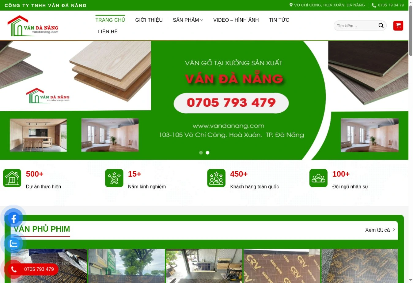
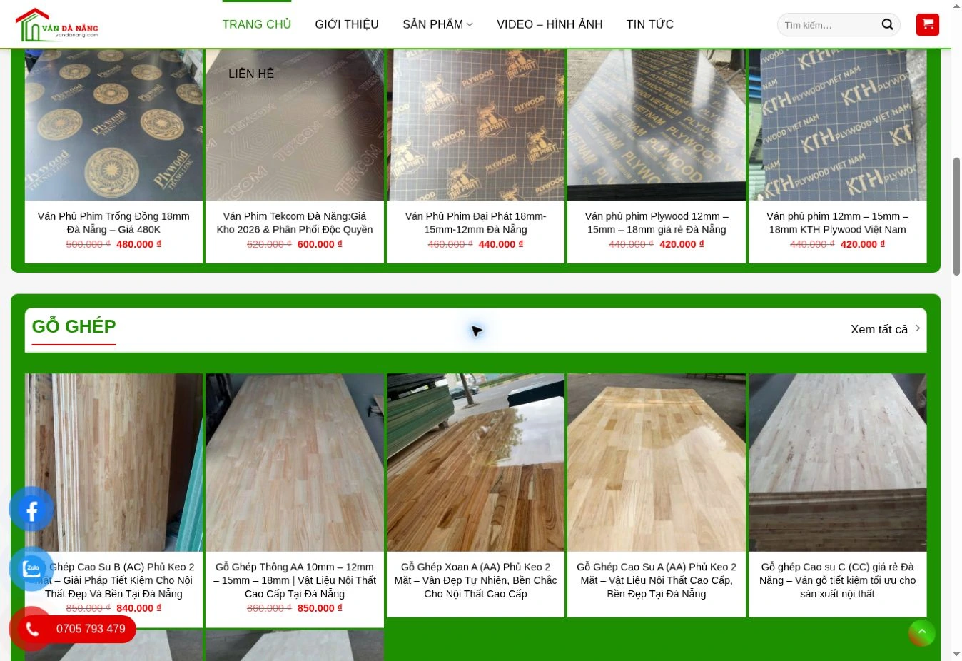
Specifications inside long names
Observation. Product names mix material, grade, thicknesses and promotional phrases. Comparable details appear in different positions.
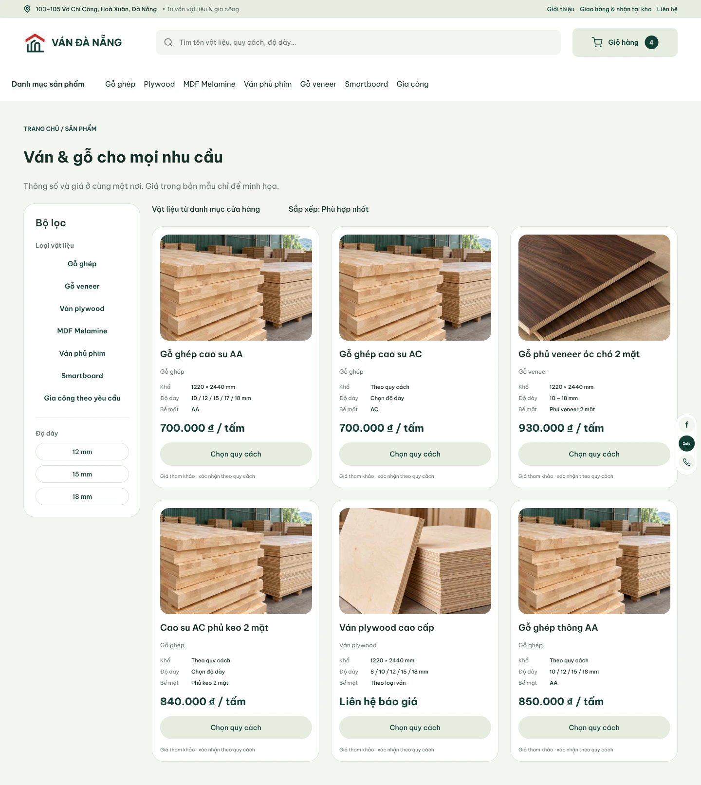
Design decision. Use a short name and separate fields for size, thickness and sales unit; add specification filters.
Different pricing modes
Observation. Some cards show a price and discount; others have no price. The grid does not explain how to proceed with a quote-only item.
Design decision. Distinguish a material estimate from a quote request. Calculate area and quantity, then confirm delivery and the final price with the store.
Contact without the selected materials
Observation. Phone and Zalo are already available. A direct contact link alone does not describe which configuration the buyer wants.
Design decision. Keep the material configuration in the request and management view; propose a prepared Zalo reply using those details.
Keep familiar routes, make the choice clearer
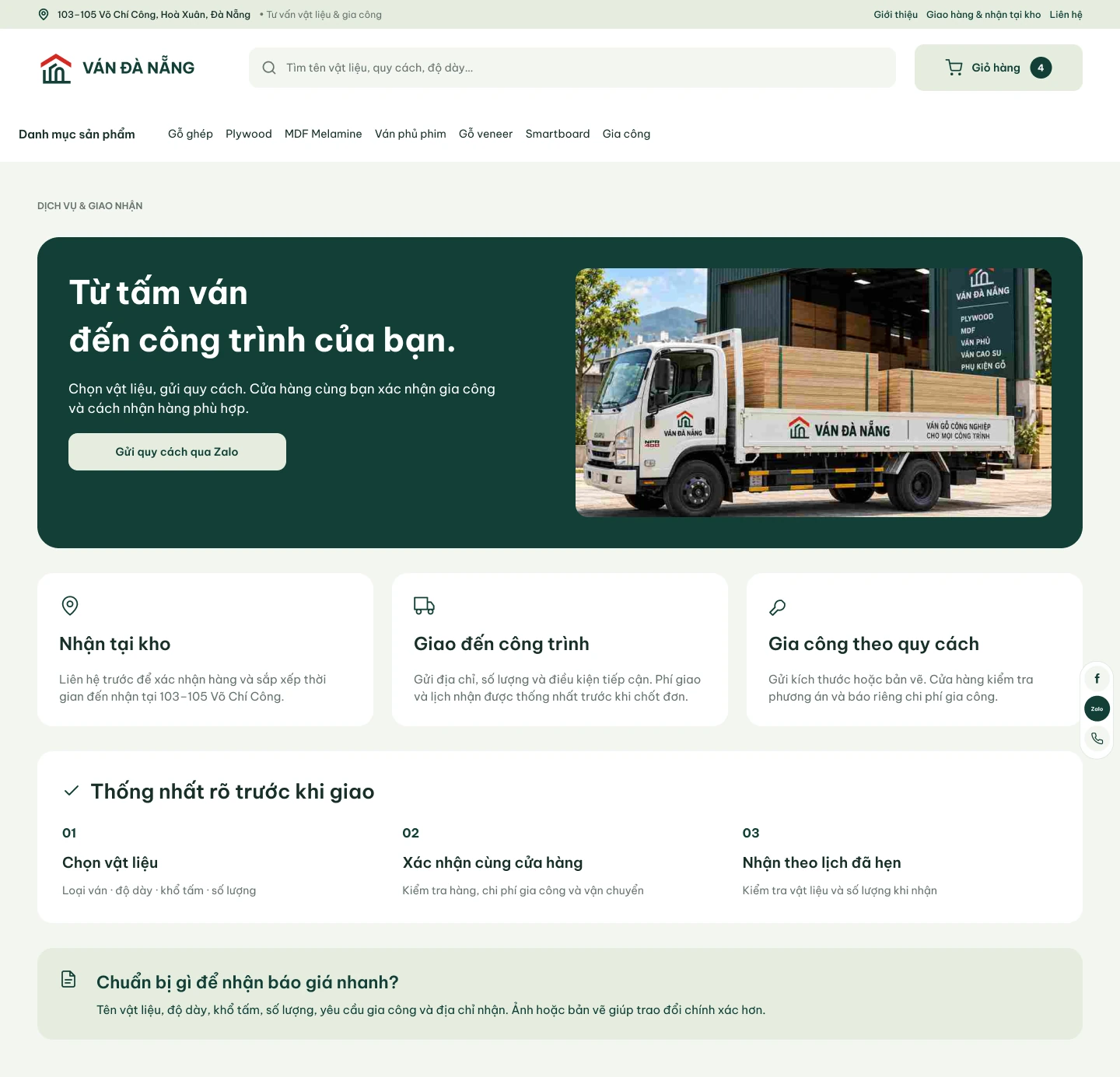
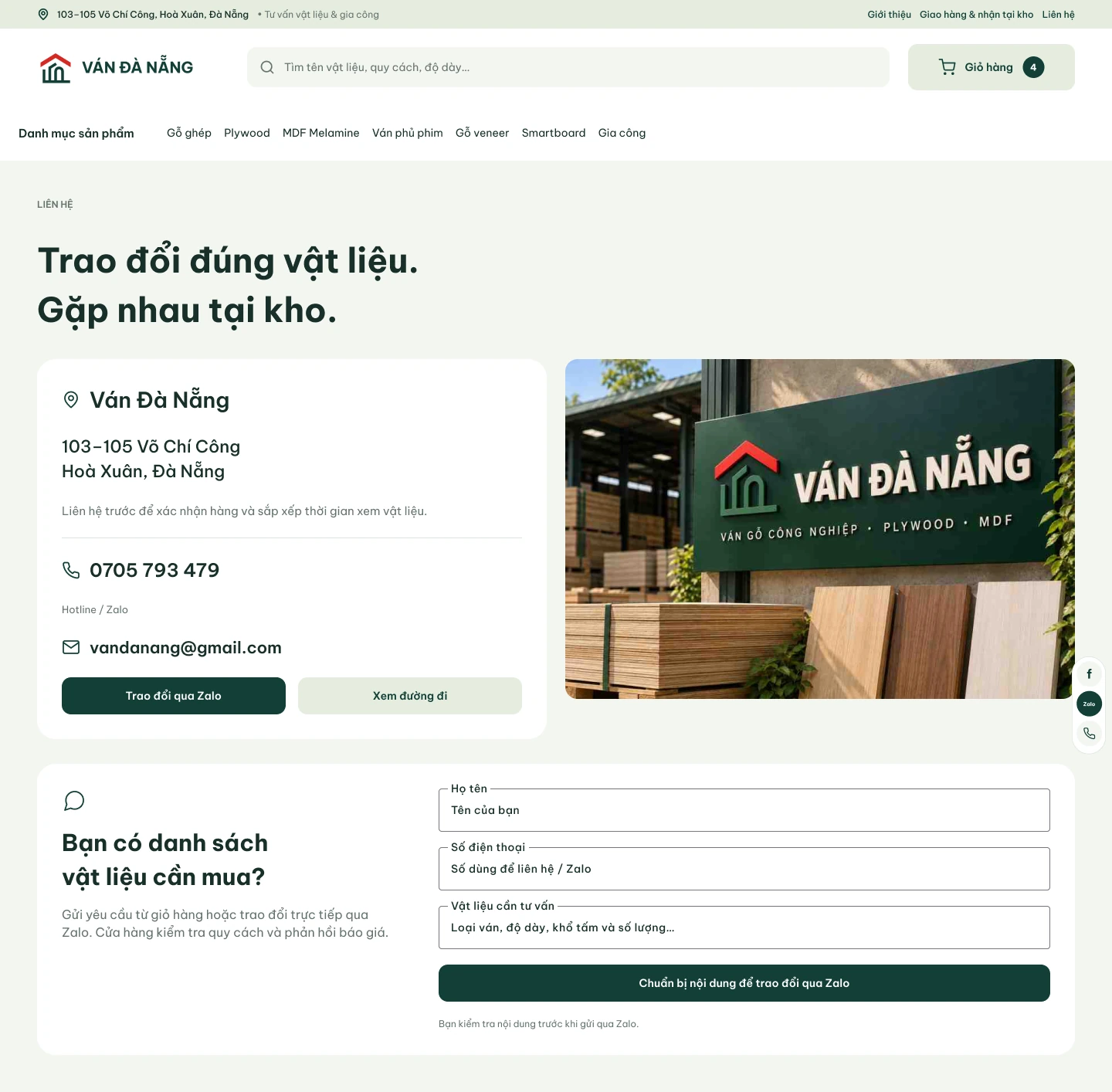
A wide search, material categories and a visible cart lead into the catalogue. Product cards separate name, dimensions, thickness and price. Delivery, processing and contact pages answer practical questions before a customer starts a conversation.
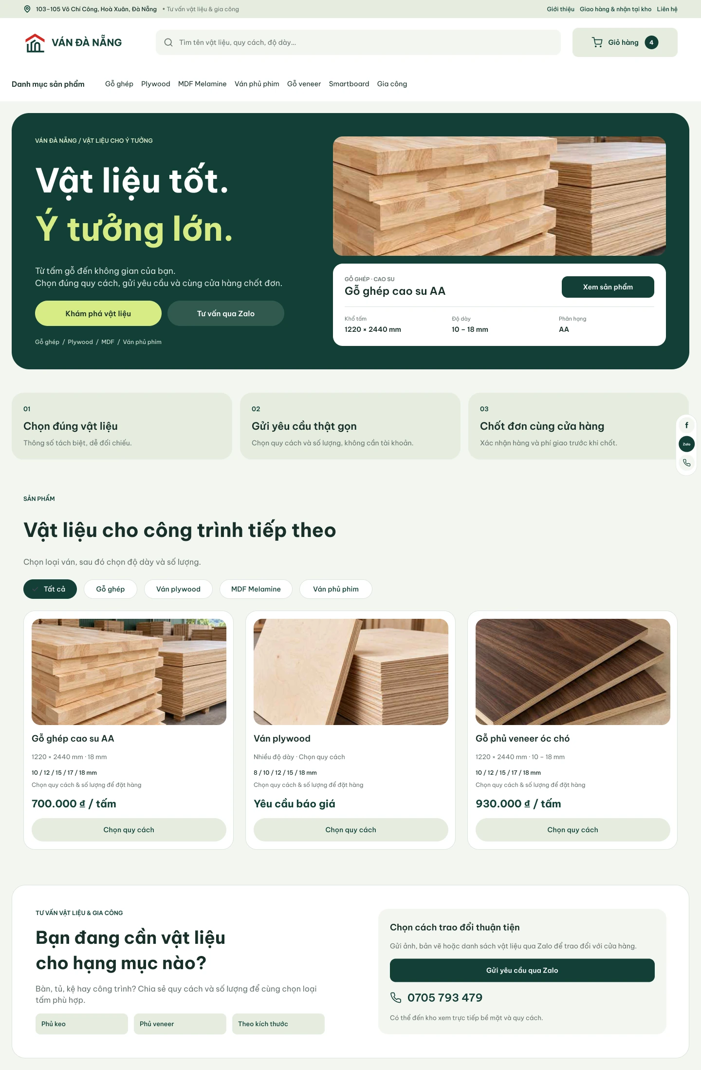
Choose the specification before asking for a quote
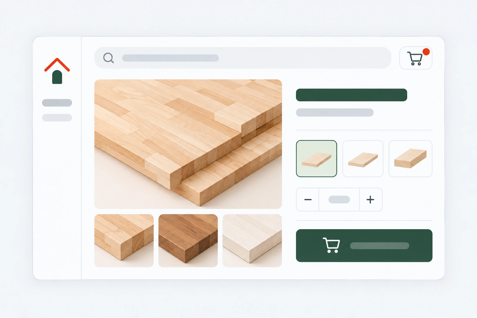
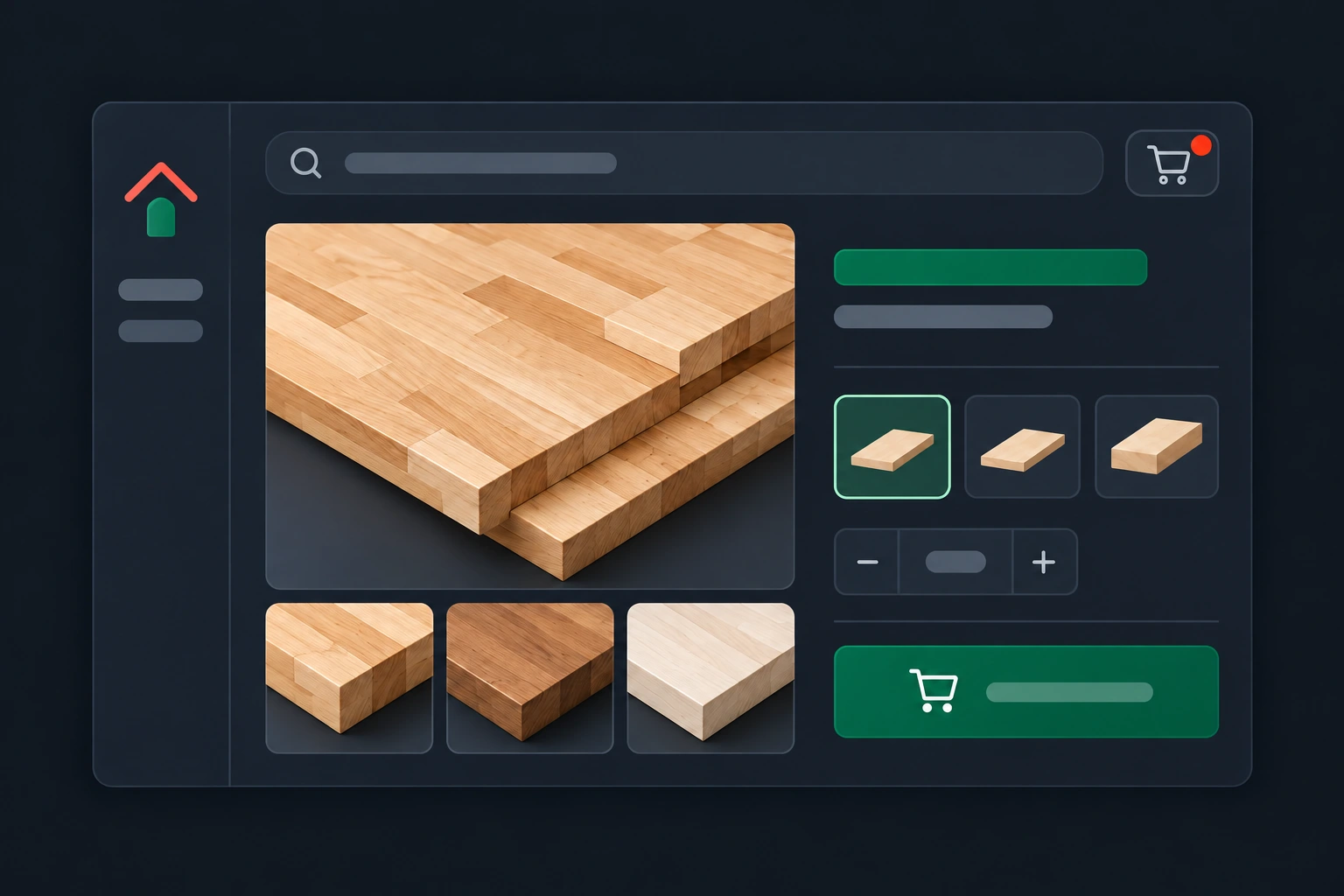
The product page places photos, specifications and ordering controls side by side. Customers choose a size and thickness, set quantity and see the total area and material estimate. Description, processing and delivery details remain available in tabs.
The demo lets you try the complete interaction: change options, switch photos and tabs, add different configurations to the cart and edit or remove them. Configuration prices are illustrative; no request is sent to the store.
Try the product page
Choose a specification, change quantity and open the cart.
Separate a request from a confirmed order
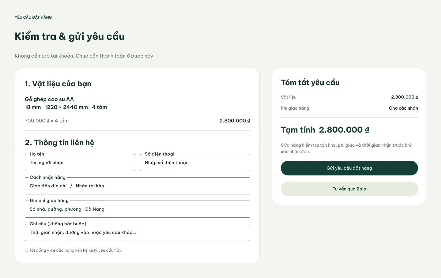
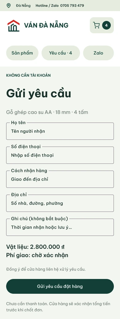
The customer checks the selected material and leaves contact information and a fulfilment method. No account is needed. The summary distinguishes the material estimate from delivery costs awaiting confirmation.
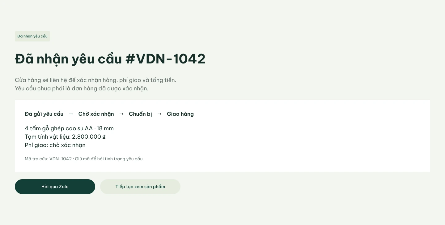
The confirmation screen gives the request a number and explains the next step. “Request received” does not imply that availability, delivery or the final price have already been agreed.
The same purchase logic on a smaller screen
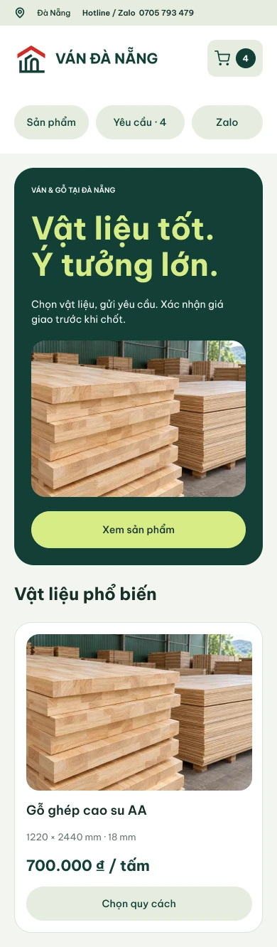
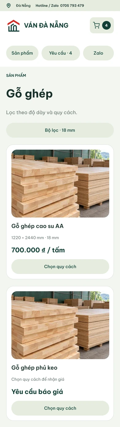
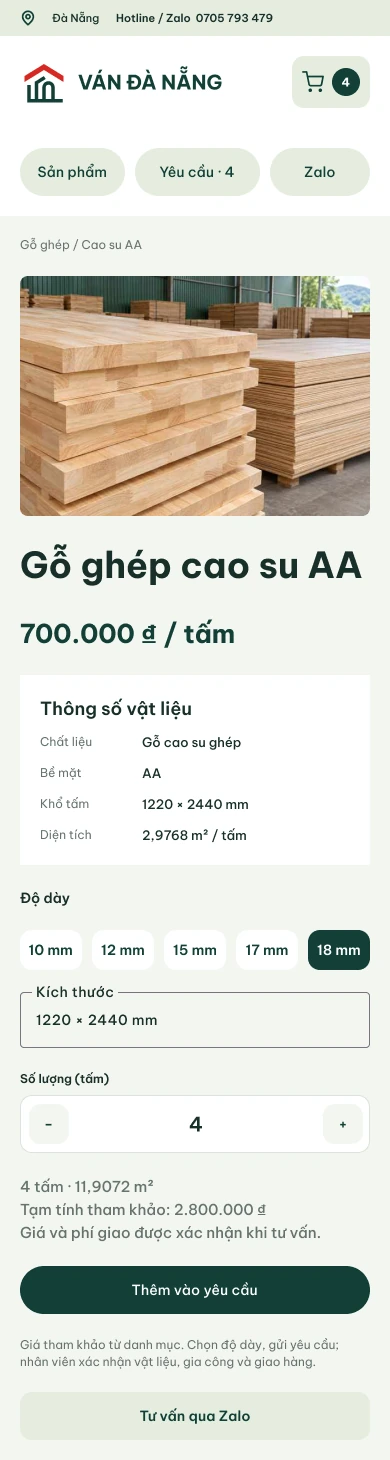
The mobile layout preserves the full decision sequence: find a material, check specifications, select options and send a request. Quantity controls have large targets, the cart count stands out, and Zalo stays within reach for questions.
Make the next action visible to the manager
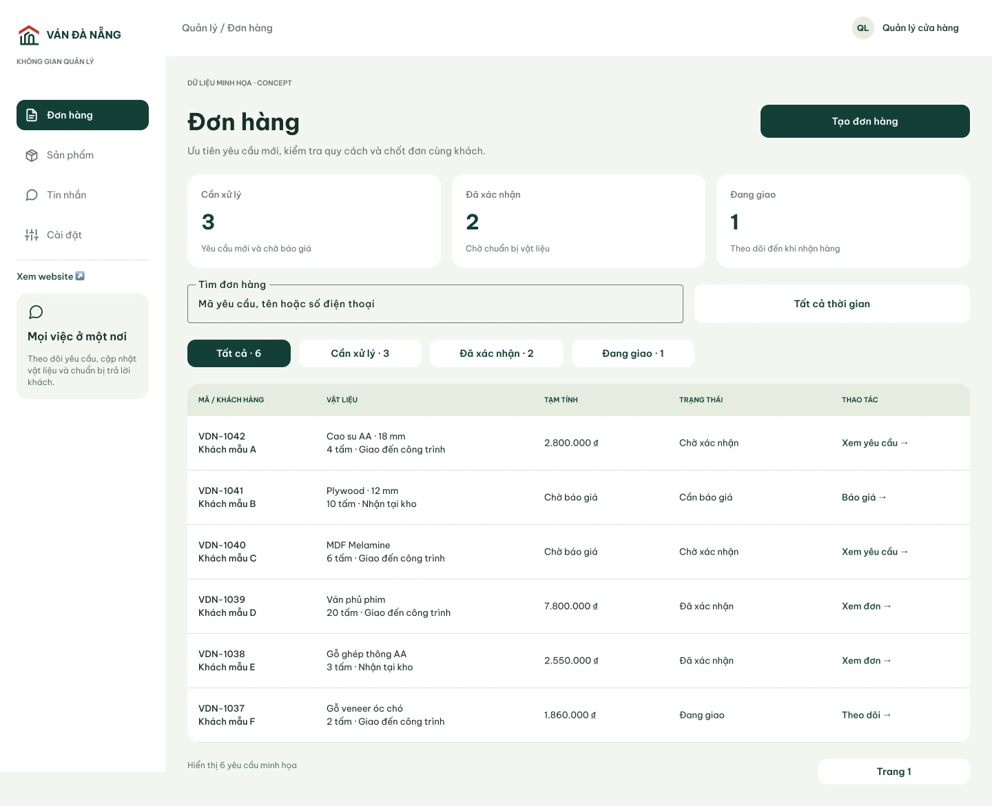
The order list prioritises new requests and shows material, quantity, estimated cost and status. The detail view brings the composition, customer information, delivery costs and confirmation together. A timeline preserves what has already happened.
Products have their own list and editor. Basic details, dimensions, thicknesses, pricing mode and photos are entered separately. A live card preview and publishing checklist help the manager check the result or save a draft.
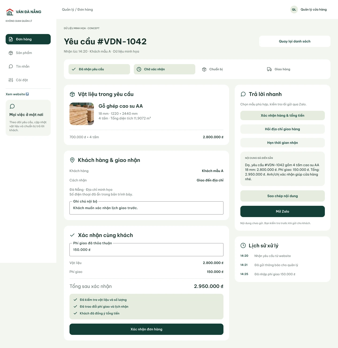
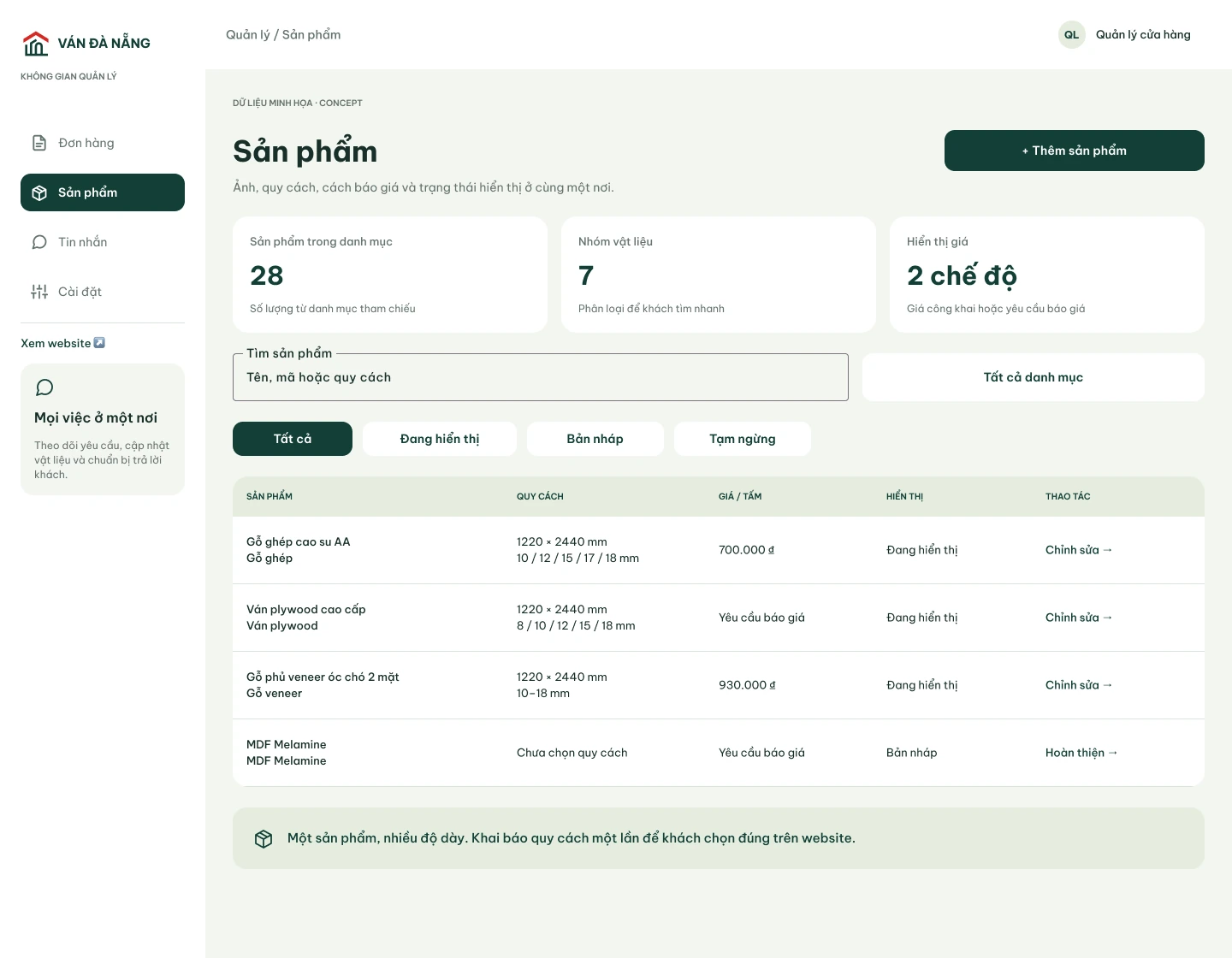
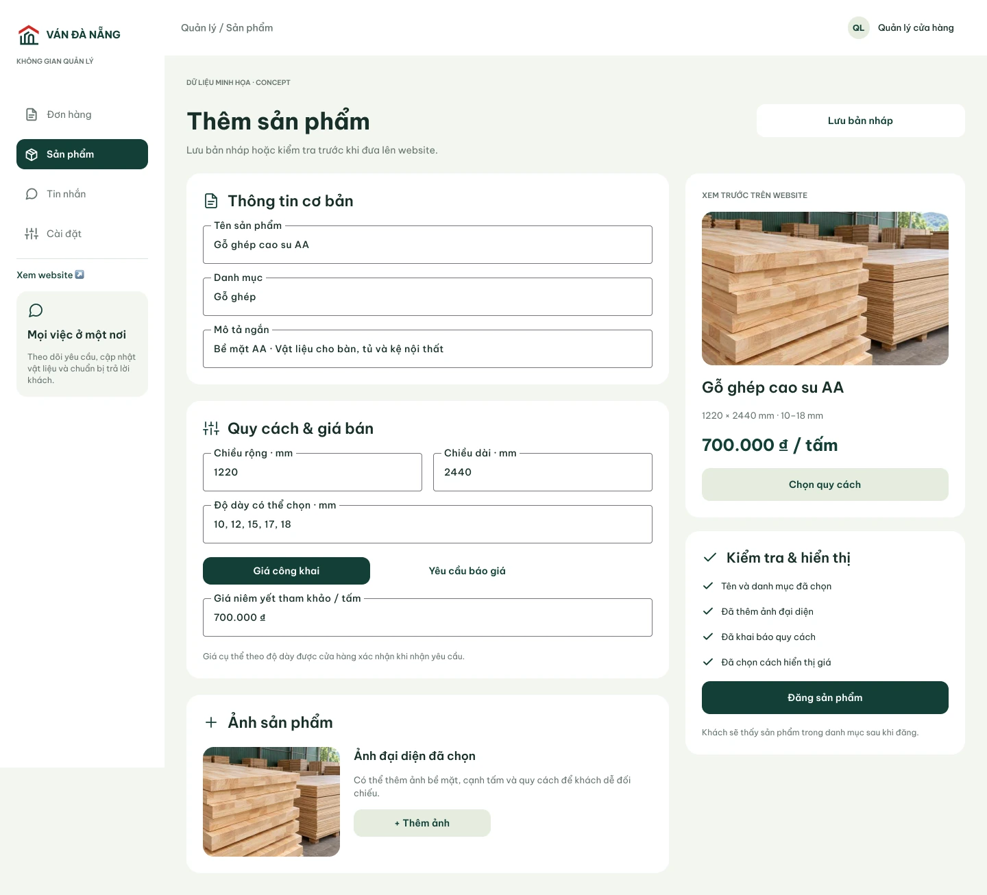
Keep the order details inside the conversation
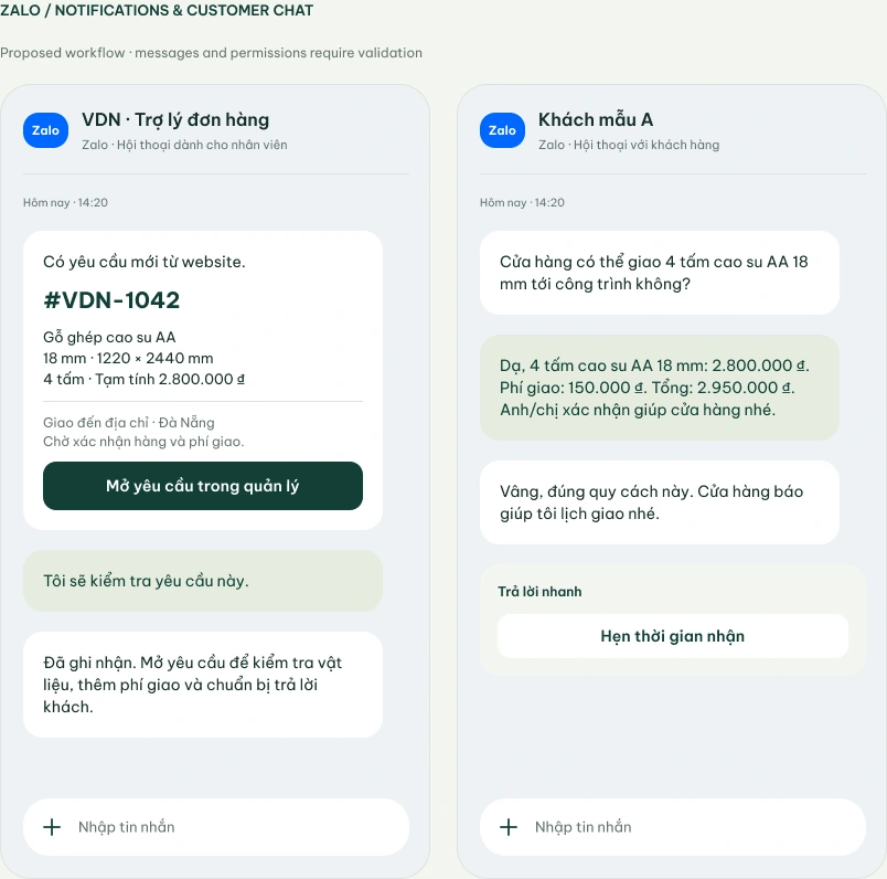
I used Zalo, already listed as a contact channel on the original site. The proposed assistant notifies staff about a request and opens its management card. The customer chat shows a prepared response with material, quantity, delivery and total.
The manager reviews the reply before sending it. These screens describe an integration concept; bot permissions and message delivery still need validation against the business workflow and Zalo platform capabilities.
Refine the house, keep recognition
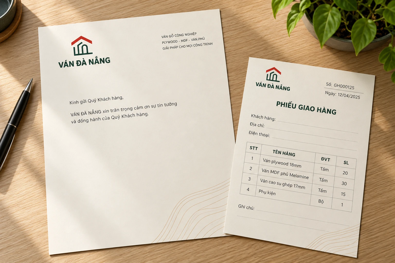
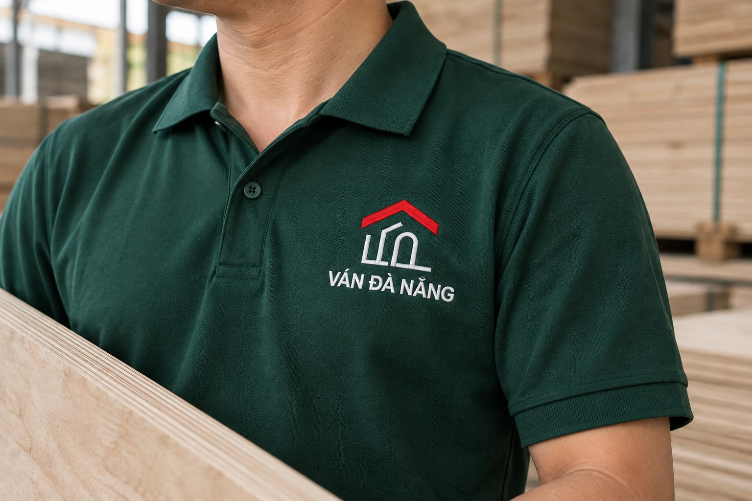
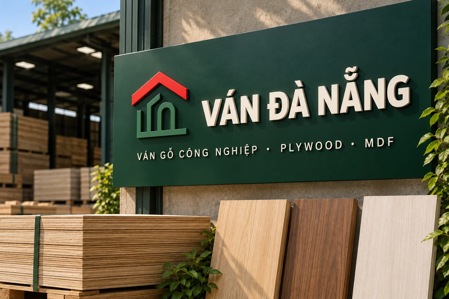
I retained the original house motif: a red roof, green walls and an arched entrance. Simpler geometry and a cleaner wordmark let it work at small sizes and across the website, documents, workwear, truck and warehouse signage.
The interface uses Material 3 components adapted to the brand palette and Be Vietnam Pro. Warm timber imagery, dense product information and direct contact options retain the local business context. The physical applications are generated mockups, not photographs of an implemented identity.


One connected journey, ready to test
The concept connects the storefront, request, management workspace and conversation around the same material configuration. The interactive demo makes the main choices testable. The next step is to check whether buyers understand the estimate and whether staff can confirm an order without asking for its composition again.