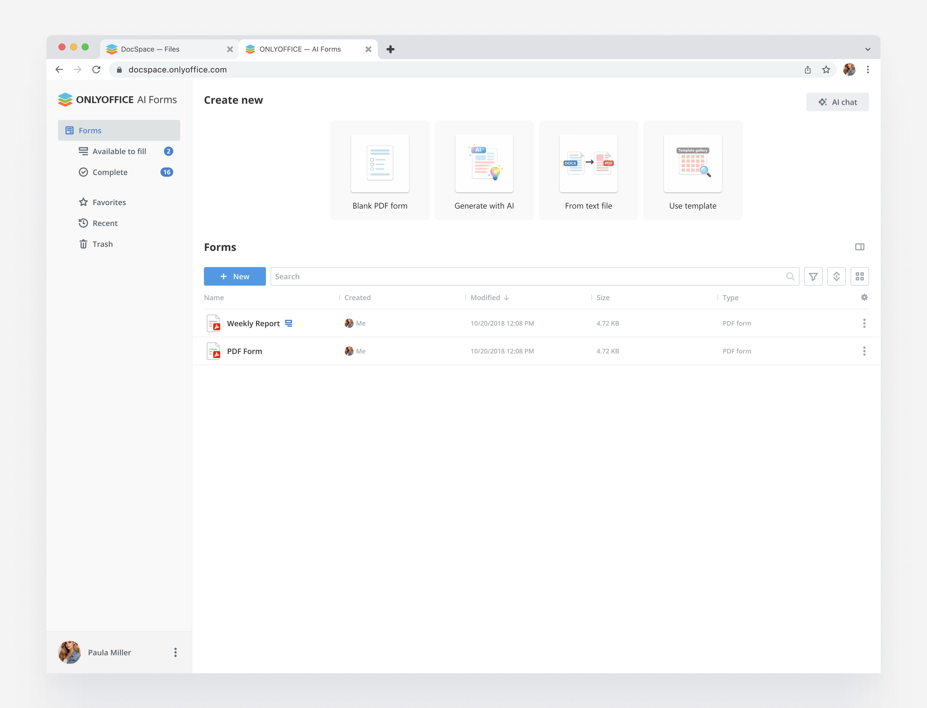

Rooms had different purposes, but their cover only showed the type
In DocSpace, rooms are spaces for working together on files. Roles determine what each participant can do inside a room.
Previously, users could upload their own image. Without one, a standard placeholder showed the room type icon. Rooms of the same type had no individual cover until a user found and uploaded an image.
The task grew out of user requests and proposals for improving the product. One goal was to make rooms visually distinct. I proposed generating a cover from the name and adding color and symbol customization to the room creation flow.
Entering a name is enough to get a cover
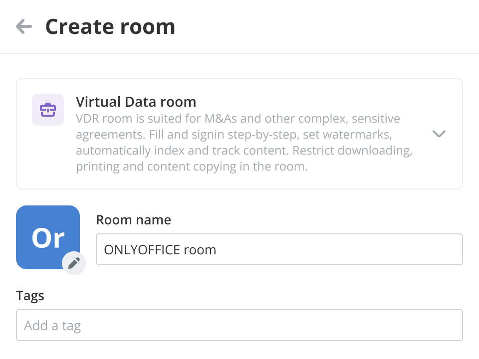
As the user enters a room name, the cover takes letters from it and receives a random background color from the palette. It immediately appears next to the name field.
This gives the room its own appearance without an uploaded image. Users see it before creating the room and can keep the suggested version or customize it.
Colors and icons can reflect the room’s purpose
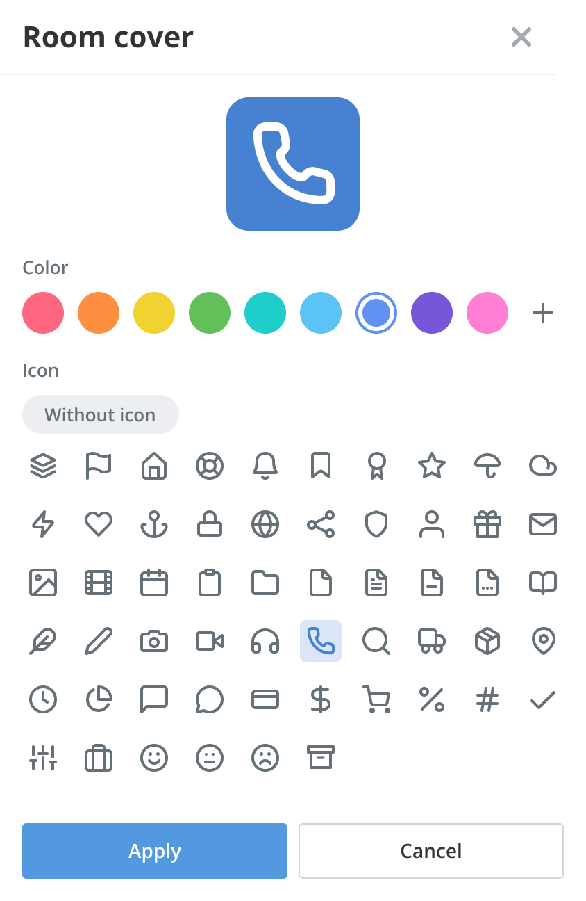
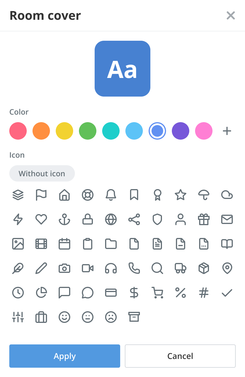
In the editor, users can change the background color or replace the letters with a thematic icon. This lets them indicate a room’s purpose and use their own visual system, for example, giving related spaces the same color or symbol.
I drew the icon set and designed its selection states. Changes appear in the preview immediately, so users can assess the color and symbol together before applying them. Clearing the icon selection restores the letters.
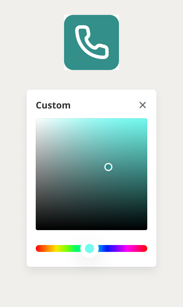
Alongside the preset palette, users can define one custom color. It is saved in the editor and marked with a pencil, allowing them to select it again or edit it.
An uploaded image is another cover option
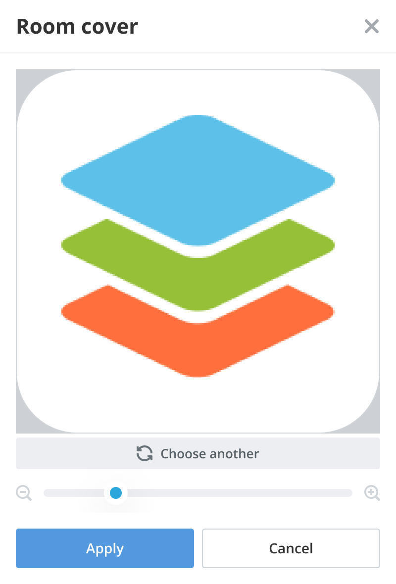
For uploading an image, I designed both a device file picker and drag and drop into the panel. Uploading opens the crop editor, where users choose the relevant part and apply it to the room.
Customization is also available after creation through the room edit and information panels. An image can be replaced or deleted. Deleting it restores a letter cover with a random color.
Rules cover sizes, contrast and different screens
The cover appears at three sizes: 32, 64 and 96 pixels. I documented proportional symbol scaling so the chosen icon could be used consistently across the interface.
Users do not select the letter or icon color. It is determined automatically from the background: black on a light background and white on a dark one. I documented this logic for development so legibility would not depend on the user’s color choice.
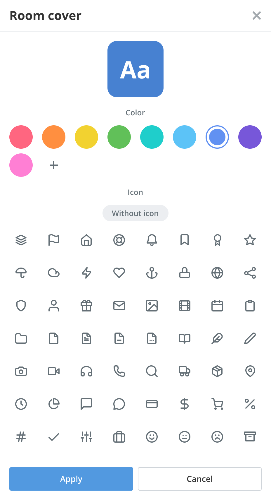
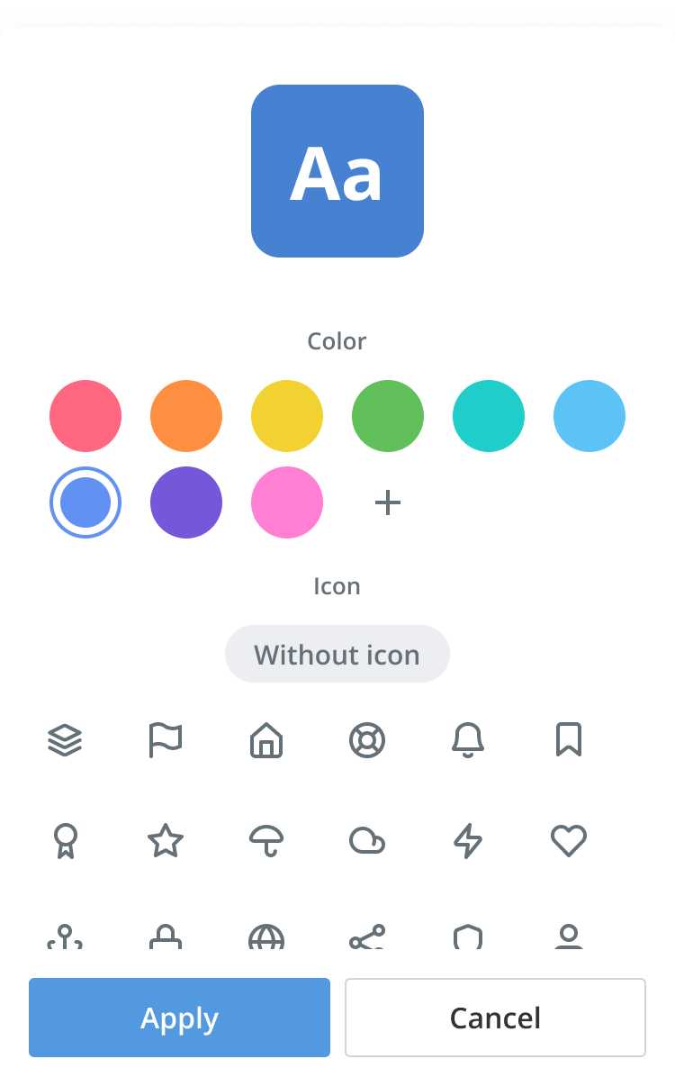
I prepared light and dark themes and desktop, tablet and phone layouts. On phones, the editor works as a panel, with larger icon touch targets. The preview stays fixed while scrolling, keeping the chosen cover visible during customization.
 32 px64 px96 px
The complete solution was released
Every planned flow was implemented and released: automatic covers, colors and icons, image upload, drag and drop, cropping and later editing.
I supported implementation and worked with developers on refinements after checks on test portals. I also designed image upload and cropping for user profile photos.
Users can now give a room its own appearance without a prepared image. The automatic version appears as the name is entered, and detailed customization is available during creation and afterward.